PICIC Insurance
PICIC’s revamping had to show its new identity, which meant its new color, primarily. For this, not only red, but red, white and grey, all the three new colors of PICIC, had to be communicated to ensure that they are retained and associated with PICIC. Therefore, the main focus at this initial stage was highlighting the new corporate identity and not its services as yet.
75 %
Increase in traffic

55 %
Increase in Leads

Challenge
With the change in its management to a new, ambitious one, PICIC Insurance Limited (PICIC) wanted to successfully re-launch itself in the market having redefined its vision, mission and company values. The brand identity (logo and color) was completely revamped that had to show the enthusiasm and passion of the new team. With the new color of red, white and grey, the new identity was somewhat clashing
with that of a competitor, so it had to be ensured that the communication voice should be efficient in creating a differentiated identity. This had to be done in order to successfully re-launch PICIC and let the market know clearly about what the brand’s promise was.
Solution
The audience was made aware of the revamping through the following elements:
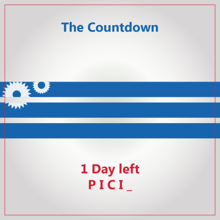
- The change of the identity: A teaser campaign was run to show that PICIC was going from blue to red.
- The new logo: The new logo was promoted through communicating what it stood for, which was basically the values that PICIC believed in.
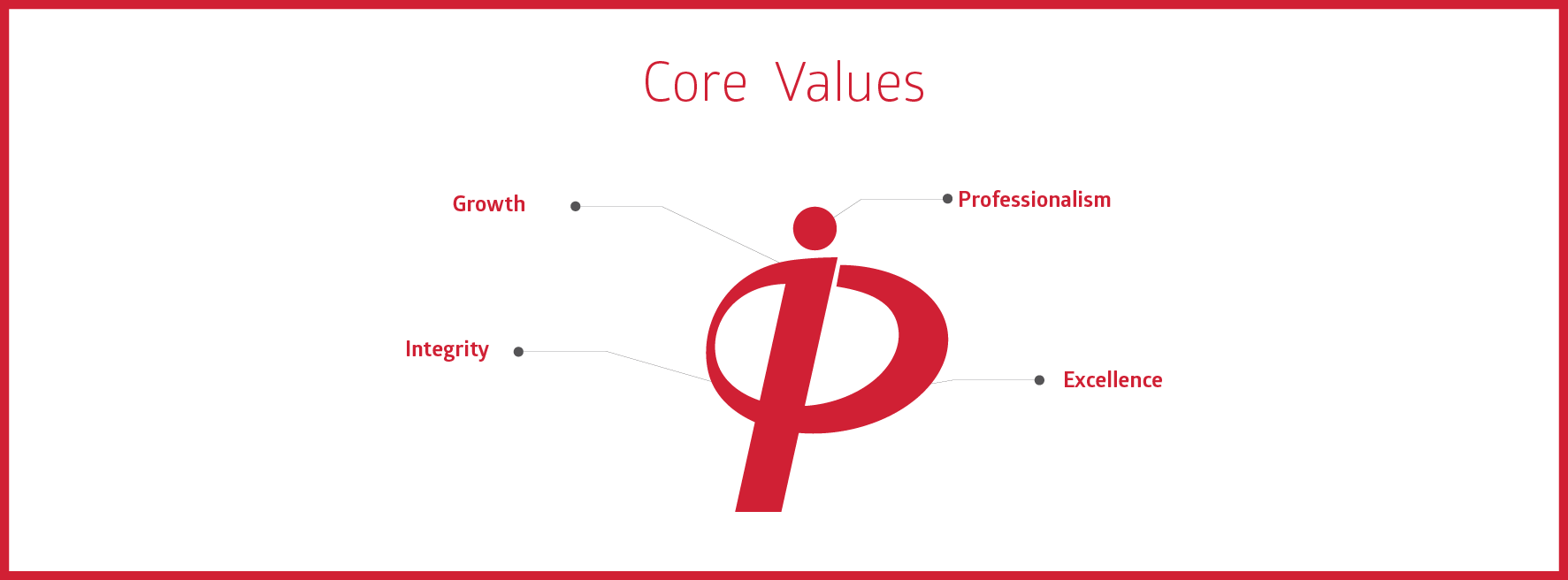
- The Company values: The four company values – professionalism, growth, excellence and integrity were set to be communicated separately too.

Results
Bceuase it was more like brand building and creating the awareness in the market at an early stage, the results were very much satisfying for the client as we reached the exact target audience which also generated sales of the insurance policies with lowest cost.